Analyze Imagery in Browser
Browser is where you can visualize and analyze data, compare and export visuals, and generate statistics. Just select your area and time of interest to inspect your Planet orders (delivered to data collections) or explore public data offered by the platform.
Want to try it out without placing an order? Use our Planet Sandbox Data for quick testing and exploration.
You can apply visualizations set up in your configurations (for example, True Color, False Color, NDVI); or make your own. You can then download high-resolution images, create timelapses, or view and export index time series.
Explore your EO Data
Browser allows you to visualize satellite data from any data collections instantly. The process in the background takes care of the selection of appropriate scenes, processing of data, as well as mosaic creation (by default, all scenes within one day are mosaicked).
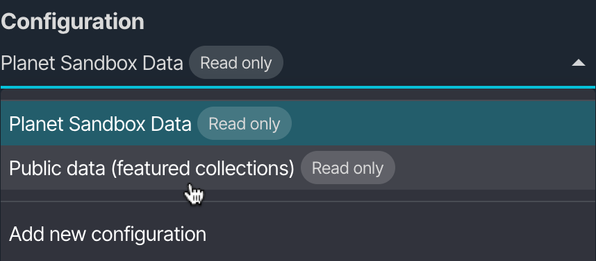
To kickstart your journey, just select the configuration you want to explore:
- With the Planet Sandbox Data configuration you can select one of its Highlights to jump straight to your area of interest.
- If you already ordered Planet data to a data collection, you will find a configuration with your order name ready to take you straight to your data. Just select it, hit the search button and visualize the data you are interested in.
- Lastly, to explore public data, select the provided "Public Data (featured collections)" configuration. If you want to see all available public data collections, you can create your own configuration using Configurations and pick which data sources you want for your analysis.
Configuration dropdown
Custom Visualizations
Satellite imagery in Browser can be visualized based on the user's desired configuration. There are already several visualizations with legends and descriptions prepared for you for most Planet and Public datasets, such as True Color, False Color or NDVI.
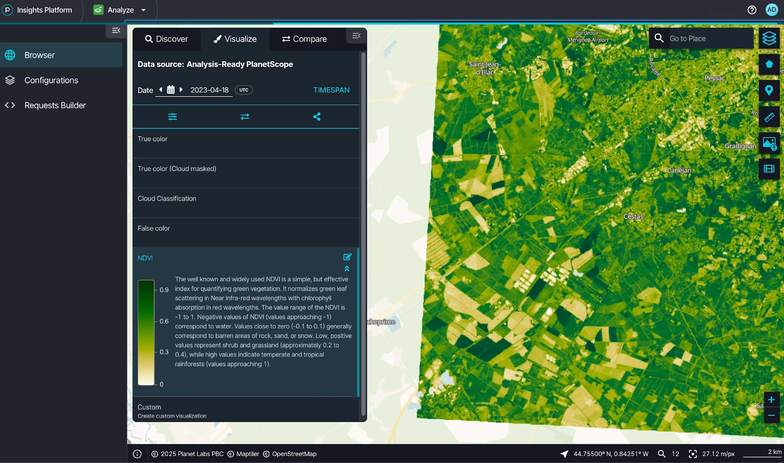
Browser interface showing NDVI panel and visualization options
You can tune the rendering of your image using the effect panel. Just click the image effects icon to edit the strength of the three color channels, contrast (gain) and luminance (gamma) or the up/downsampling method used.
You can go further by choosing Custom in the visualization list to
- Create a composite of any combination of bands by simply dragging and dropping the bands into the RGB channels
- Create an index by dragging and dropping bands into the equation.
- Use an evalscript to render a fully custom analysis logic.
The evalscript functionality is a powerful tool for visualizing satellite data. Using Javascript, you have full control over your visualization, allowing you to make computations, logical operators and conditions, data fusion, multitemporal scripting, etc.
Data fusion even makes it possible to combine different satellite data collections in a single image, take advantage of each, and bring your scripting to a new level.
Read more about data fusion in our blog post, and visit our custom scripts documentation to get started with your custom evalscripts.
Image Comparison
If you would like to compare satellite imagery over an area from different dates, different visualizations or from different data collections altogether, you can do that by adding each image to the compare panel, and compare them using split or opacity sliders.
Just click the compare icon to add your selected images to the comparison, before heading over to the compare tab.
Time-lapse
Time-lapse functionality makes it possible for you to create gifs of changes through time.
To create a time-lapse animation:
Go to your area of interest.
Select your preferred data collection (e.g., ARPS).
Choose a visualization setting (e.g., NDVI).
Click the Create time-lapse animation icon
Set your desired time range and preferred data frequency.
Browser will gather all the available scenes and present them as "frames."
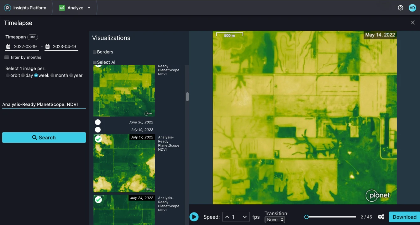
Browser time-lapse interface showing visualization panel, time range settings, and playback options
You can then preview the time-lapse in the right part of the window. Note that the cloud coverage condition is applied on the full scene level, so there might still be some frames with too many clouds. Just uncheck anomalous frames on the left. Note also that timelapse functionality supports only 300 images at once, so if you need a longer time-frame, select for example a monthly data frequency or click on the cogs to access advanced settings of the timelapse.
Image Download
You can download images in various file formats by clicking the download image icon
You have three options for downloading:
- Basic export - you can quickly generate and download a PNG or JPG image, just selecting whether you want to keep the logo, legend or captions.
- Analytical export - you can tune your resolution, projection, bands and exports in various file formats such as TIFF for further analysis.
- High-res print - you have the option to export a High-res print and control the image width, height and DPI.
Statistical Analysis
To visualize a time series evolution of an index (e.g., NDVI) over an area or pixel, select the pixel using the picker or outline the area using the AOI tools from the AOI ribbon .
You can then click the statistical info chart icon . Note that this works only for layers with one output component (for example, indices, single band products, planetary variables, etc.).
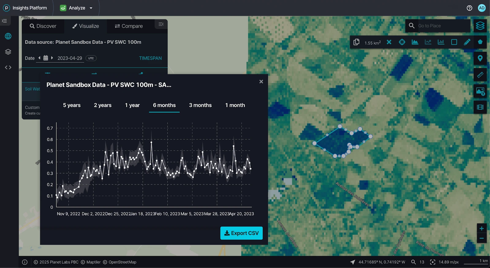
Browser interface showing time series chart for pixel analysis with Export CSV option
Depending on the data source, Browser allows you to filter out data points based on the cloud cover.
Histogram
After drawing your AOI you can also check how many pixels in your area of interest have a specific index value - just click on the histogram icon . This is especially useful when doing analysis or creating custom visualizations.