Create AOI-Level Statistics for Sentinel-2 L2A Imagery
This guide will walk you through the process of using a Statistical API to retrieve AOI-level statistics for Sentinel-2 L2A imagery. We will cover the following steps:
- Defining an Area of Interest (AOI) as a GeoJSON polygon
- Writing an NDVI (Normalized Difference Vegetation Index) evalscript to define the statistical output
- Making a Statistical API request
- Interpreting the JSON response
- Visualizing results in Python
Registering an OAuth2 Client
Before submitting any Statistical API requests, you will first need to register an OAuth2 client. A comprehensive guide on OAuth2 authentication and how to register an OAuth2 client can be found here.
Defining an AOI as a GeoJSON Polygon
An AOI is needed to make Statistical API requests. This AOI can be defined as a GeoJSON polygon. There are many online resources that can help with creating and validating GeoJSON polygons, such as geojson.io. The example below shows what this could look like.
{
  "type": "FeatureCollection",
  "features": [
    {
      "type": "Feature",
      "properties": {},
      "geometry": {
        "type": "Polygon",
        "coordinates": [
          [
            [-81.07147945222945, 43.67490435965843],
            [-81.06495615860527, 43.67223547577635],
            [-81.05882821611033, 43.680122637871705],
            [-81.06521972602458, 43.682624391132805],
            [-81.06785540021637, 43.67912190735805],
            [-81.06663640090248, 43.67864536315142],
            [-81.06920618323896, 43.67585750370887],
            [-81.07026045291556, 43.67631024182887],
            [-81.07147945222945, 43.67490435965843]
          ]
        ]
      }
    }
  ]
}
There are also Planet tools that can be used to create a GeoJSON polygon. More information about this can be found in the Tools documentation. Once the AOI has been defined, we can save it as a GeoJSON file. This makes it easy to load when creating the request to the Statistical API.
Creating an Evalscript
An evalscript is a custom piece of JavaScript code that specifies how satellite data will be processed and what data will be returned. Statistical API can be used in a similar way to others (such as Process API). The main difference is that the results of Statistical API are aggregated statistical values of satellite data, not entire images. Because of this, Statistical API allows you to avoid downloading and processing large amounts of satellite data. All general rules for evalscripts apply, but they operate slightly differently with Statistical API:
- The
evaluatepixel()function must always return adataMaskoutput, in addition to other outputs, anddataMaskoutput defines which pixels are excluded from calculations. - The default value of sampleType is
FLOAT32. - The
output.bandsparameter in thesetup()function can be arrays, making it possible to specify custom names for the output bands. It also allows you to specify different outputdataMaskfor different outputs.
It is a crucial component of the Statistical API request. An example script for Sentinel-2 L2A is shown below.
//VERSION=3
function setup() {
  return {
    input: [
      {
        bands: ['B04', 'B08', 'SCL', 'dataMask'],
      },
    ],
    output: [
      {
        id: 'ndvi',
        bands: 1,
      },
      {
        id: 'dataMask',
        bands: 1,
      },
    ],
  };
}

function evaluatePixel(samples) {
  // Sentinel-2 L2A SCL values for clouds, cloud shadows, and snow:
  // 3: Cloud shadows
  // 8: Cloud medium probability
  // 9: Cloud high probability
  // 10: Thin cirrus
  // 11: Snow or ice (optional: include if you want to filter snow)
  const isCloud = [3, 8, 9, 10].includes(samples.SCL);

  // Exclude invalid/nodata pixels AND cloudy pixels
  const validPixel = samples.dataMask === 1 && !isCloud ? 1 : 0;

  let index = (samples.B08 - samples.B04) / (samples.B08 + samples.B04);

  return {
    ndvi: [index],
    dataMask: [validPixel],
  };
}
This script requests NDVI statistics from Sentinel-2 L2A imagery. You can practice writing and using evalscripts in Requests Builder.
Making the Statistical API Request
For the AOI that you have specified, you can create a Statistical API request to calculate the NDVI mean and percentiles for Sentinel-2 L2A imagery. There are several pieces of information needed to make the request. You will need inputs for:
- AOI boundary definition
- Time interval selection
- Evalscript configuration
- Aggregation and histogram specifications
When constructing the Statistical API request, we will use the SentinelHubStatistical class from the sentinelhub-py package.
Information on how to install and configure this package can be found in the PlanetScope Imagery quick start guide, sentinelhub-py package.
import getpass
import json
from sentinelhub import (
    CRS,
    DataCollection,
    Geometry,
    SentinelHubStatistical,
    SHConfig,
)

# 1. API Credentials & Configuration
# Enter your OAuth2 credentials here
config = SHConfig()
config.sh_client_id = getpass.getpass("Enter your OAuth Client ID")
config.sh_client_secret = getpass.getpass("Enter your OAuth Client Secret")
config.save("SH_creds")

# Pass your OAuth Client credentials to SHConfig
config = SHConfig("SH_creds")

# 2. Set a time interval
# Specify a start and end date
time_interval = ("2025-01-01", "2026-01-01")

# Specify a resolution
resx = 0.0001
resy = 0.0001

# 3. Specify AOI - Loaded from GeoJSON file
with open("aoi.geojson") as f:
    geojson_data = json.load(f)

# Handle FeatureCollection vs Feature vs Geometry objects safely
if geojson_data.get("type") == "FeatureCollection":
    geometry_obj = geojson_data["features"][0]["geometry"]
elif geojson_data.get("type") == "Feature":
    geometry_obj = geojson_data["geometry"]
else:
    geometry_obj = geojson_data

aoi_geometry = Geometry(geometry_obj, crs=CRS.WGS84)


# 4. Provide an evalscript
evalscript="""
//VERSION=3
function setup() {
  return {
    input: [
      {
        bands: ['B04', 'B08', 'SCL', 'dataMask'],
      }
    ],
    output: [
      {
        id: 'ndvi',
        bands: 1,
      },
      {
        id: 'dataMask',
        bands: 1
      },
    ],
  };
}

function evaluatePixel(samples) {
  // Sentinel-2 L2A SCL values for clouds, cloud shadows, and snow:
  // 3: Cloud shadows
  // 8: Cloud medium probability
  // 9: Cloud high probability
  // 10: Thin cirrus
  // 11: Snow or ice (optional: include if you want to filter snow)
  const isCloud = [3, 8, 9, 10].includes(samples.SCL);

  // Exclude invalid/nodata pixels AND cloudy pixels
  const validPixel = samples.dataMask === 1 && !isCloud ? 1 : 0;

  let index = (samples.B08 - samples.B04) / (samples.B08 + samples.B04);

  return {
    ndvi: [index],
    dataMask: [validPixel],
  };
}
"""

# 5. Spatial Resolution & Aggregation Specification
aggregation = SentinelHubStatistical.aggregation(
    evalscript=evalscript,
    time_interval=time_interval,
    aggregation_interval="P5D",  # Specify how often data is collected
    resolution=(resx, resy),  # 10m spatial resolution
)

# 6. Calculations (Histograms & Percentiles)
calculations = {
    "ndvi": {
        "histograms": {"default": {"nBins": 10, "lowEdge": -1.0, "highEdge": 1.0}},
        "statistics": {"default": {"percentiles": {"k": [25, 50, 75]}}},
    },
}

# 7. Construct the Statistical API Request
request = SentinelHubStatistical(
    aggregation=aggregation,
    input_data=[
        SentinelHubStatistical.input_data(
            data_collection=DataCollection.SENTINEL2_L2A,
        ),
    ],
    geometry=aoi_geometry,
    calculations=calculations,
    config=config,
)

# 8. Execute Request and Retrieve Results
stats_data = request.get_data()

# Save the results to a JSON file for later use
with open("statsreq.json", "w") as f:
    json.dump(stats_data[0], f)

# Print formatted output snippet
print(json.dumps(stats_data[0]["data"][:2], indent=2))
When the Statistical API request is executed, the data will be returned as JSON objects.
In this example output, the time_interval was specified as the period starting January 1, 2025, and ending January 1, 2026.
The aggregation_interval was set as 5 days. The snippet shows the NDVI statistics for July 25, 2025 to July 30, 2025. Intervals where clouds or snow mask every pixel in the AOI return NaN values instead of statistics.
If the value of time_interval is not exactly divisible by the value of aggregation_interval, the last interval will be dismissed by default. To avoid this, the user can instead set the lastIntervalBehavior to shorten or extend the final time interval.
{
  "interval": {
    "from": "2025-07-25T00:00:00Z",
    "to": "2025-07-30T00:00:00Z"
  },
  "outputs": {
    "ndvi": {
      "bands": {
        "B0": {
          "stats": {
            "min": 0.23774807155132294,
            "max": 0.9362297058105469,
            "mean": 0.9091488656452544,
            "stDev": 0.05150840185985422,
            "sampleCount": 13208,
            "noDataCount": 6829,
            "percentiles": {
              "25.0": 0.9125766754150391,
              "50.0": 0.9194529056549072,
              "75.0": 0.9239373803138733
            }
          },
          "histogram": {
            "bins": [
              {
                "lowEdge": -1,
                "highEdge": -0.8,
                "count": 0
              },
              {
                "lowEdge": -0.8,
                "highEdge": -0.6,
                "count": 0
              },
              {
                "lowEdge": -0.6,
                "highEdge": -0.3999999999999999,
                "count": 0
              },
              {
                "lowEdge": -0.3999999999999999,
                "highEdge": -0.19999999999999996,
                "count": 0
              },
              {
                "lowEdge": -0.19999999999999996,
                "highEdge": 0,
                "count": 0
              },
              {
                "lowEdge": 0,
                "highEdge": 0.20000000000000018,
                "count": 0
              },
              {
                "lowEdge": 0.20000000000000018,
                "highEdge": 0.40000000000000013,
                "count": 18
              },
              {
                "lowEdge": 0.40000000000000013,
                "highEdge": 0.6000000000000001,
                "count": 36
              },
              {
                "lowEdge": 0.6000000000000001,
                "highEdge": 0.8,
                "count": 96
              },
              {
                "lowEdge": 0.8,
                "highEdge": 1,
                "count": 6229
              }
            ],
            "overflowCount": 0,
            "underflowCount": 0
          }
        }
      }
    }
  }
}
Depending on the time_interval and aggregation_interval used, the output file may be longer or shorter.
The JSON output provides pixel-level aggregate statistics (NDVI mean and percentiles), computed over your AOI for your specified time window.
NDVI theoretically ranges from -1 to +1. The NDVI value gives you information on plant health and vegetation density in an area.
- -1 to -0.1: Negative values typically represent bodies of water, snow, or cloud cover. They absorb visible red light and reflect little to no infrared light.
- -0.1 to 0.1: This is usually representative of barren areas of rock or sand. It can also indicate built-up city areas, where there is little to no vegetation.
- 0.1 to 0.3: Low positive values usually indicate sparse vegetation, such as grassland and shrubland.
- 0.3 to 0.6: These values are a sign of moderate vegetation, such as temperate forests. Unhealthy crops may also fall into this category.
- 0.6 to 0.9: This is the normal range for healthy crops.
- 0.9 to 1: This represents dense and overgrown vegetation, such as rainforests.
The table below summarizes the statistical output for the evaluated area of interest (AOI) over the specified 5-day aggregation interval in July:
| Metric | Value | Interpretation |
|---|---|---|
| Mean | 0.909 | Dense, healthy vegetation canopy overall. |
| Median (50%) | 0.919 | Very close to the mean, indicating a mostly symmetrical distribution. |
| Std Deviation | 0.052 | Low variability, which indicates a largely uniform land-cover type across the field. |
| Min / Max | 0.238 to 0.936 | Spans from sparse vegetation at field edges up to dense, healthy crop canopy. |
| 25th to 75th IQR | 0.913 to 0.924 | Central 50% of the pixels fall solidly in the dense vegetation range. |
| Valid Pixels | 6,379 | Total counted across histogram bins (13,208 sample count minus 6,829 no-data/masked pixels). |
Visualizing Results in Python
The data can be normalized into a pandas dataframe for further analysis. Before running this script, ensure that all necessary packages are installed in your Python environment.
Packages that have not yet been installed can be installed using the pip install command in your terminal, for example, pip install pandas.
import json
import matplotlib.dates as mdates
import matplotlib.pyplot as plt
import pandas as pd
from IPython.display import display
import seaborn as sns
import numpy as np

# 1. Load the nested JSON file
with open("statsreq.json", "r") as f:
    raw_data = json.load(f)

# 2. Extract and flatten the 'data' array
df = pd.json_normalize(raw_data["data"])

# 3. Rename nested columns to flat names expected by your plotting code
column_mapping = {
    "interval.from": "date_from",
    "outputs.ndvi.bands.B0.stats.mean": "mean",
    "outputs.ndvi.bands.B0.stats.stDev": "stDev",
    "outputs.ndvi.bands.B0.stats.min": "min",
    "outputs.ndvi.bands.B0.stats.max": "max",
    "outputs.ndvi.bands.B0.stats.percentiles.50.0": "median",
}

df = df.rename(columns=column_mapping)

# 4. Convert string 'NaN's to true floats and filter out invalid rows
df["date_from"] = pd.to_datetime(df["date_from"])

numeric_cols = ["mean", "stDev", "min", "max", "median"]
for col in numeric_cols:
    if col in df.columns:
        df[col] = pd.to_numeric(df[col], errors="coerce")

df_clean = df.dropna(subset=["mean"]).copy()

# 5. Check cleaned DataFrame
print(f"Total time intervals: {len(df)}")
print(f"Valid data intervals: {len(df_clean)}")
display(df_clean[["date_from", "mean", "stDev", "min", "max", "median"]])
This prints the total number of intervals (73) and the number of valid intervals (25), then creates the following pandas dataframe.
| Index | date_from | mean | stDev | min | max | median |
|---|---|---|---|---|---|---|
| 3 | 2025-01-16 00:00:00+00:00 | 0.047546 | 0.015170 | 0.020159 | 0.068519 | 0.047673 |
| 11 | 2025-02-25 00:00:00+00:00 | -0.007287 | 0.011145 | -0.024429 | 0.035450 | -0.009863 |
| 13 | 2025-03-07 00:00:00+00:00 | -0.061077 | 0.016350 | -0.084916 | 0.135049 | -0.065083 |
| 15 | 2025-03-17 00:00:00+00:00 | 0.236009 | 0.020515 | 0.066230 | 0.394889 | 0.232509 |
| 25 | 2025-05-06 00:00:00+00:00 | 0.242079 | 0.046144 | 0.175185 | 0.641942 | 0.230769 |
| ... | ... | ... | ... | ... | ... | ... |
| 40 | 2025-07-20 00:00:00+00:00 | 0.876780 | 0.053299 | 0.339326 | 0.913173 | 0.894774 |
| 41 | 2025-07-25 00:00:00+00:00 | 0.909149 | 0.051508 | 0.237748 | 0.936230 | 0.919453 |
| 42 | 2025-07-30 00:00:00+00:00 | 0.704247 | 0.029616 | 0.340616 | 0.730516 | 0.710553 |
| ... | ... | ... | ... | ... | ... | ... |
| 59 | 2025-10-23 00:00:00+00:00 | 0.217788 | 0.043688 | 0.156146 | 0.617737 | 0.209136 |
| 61 | 2025-11-02 00:00:00+00:00 | 0.203789 | 0.035427 | 0.156923 | 0.562738 | 0.195780 |
The index values skip numbers because the 48 intervals with no valid pixels (all NaN) were removed. These gaps occur when cloud cover or snow masks every pixel in the AOI for that interval, which is common over this field during the Canadian winter.
This dataframe can now be used to visualize your results. We will now go through some examples that will instruct you on how to create an NDVI time series, and a mean NDVI histogram and boxplot.
Create a Mean NDVI Time Series
# NDVI time series

# 1. Parse dates into datetime objects
df["date_from"] = pd.to_datetime(df["date_from"])

# 2. Convert string 'NaN's to true floats
numeric_cols = ["mean", "stDev", "min", "max", "median"]
for col in numeric_cols:
    if col in df.columns:
        df[col] = pd.to_numeric(df[col], errors="coerce")

# 3. Filter out NaN rows (intervals with no data or full cloud cover)
df_clean = df.dropna(subset=["mean"]).copy()

# 4. Plot NDVI time series (only if we have valid non-NaN rows)
if len(df_clean) > 0:
    plt.figure(figsize=(12, 5))

    plt.plot(
        df_clean["date_from"],
        df_clean["mean"],
        marker="o",
        markersize=6,
        linestyle="-",
        color="#4e0db7",
        linewidth=2,
        label="Mean NDVI",
    )

    plt.fill_between(
        df_clean["date_from"],
        df_clean["mean"] - df_clean["stDev"],
        df_clean["mean"] + df_clean["stDev"],
        color="#373b7d",
        alpha=0.2,
        label="±1 Std Dev",
    )

    # Styling & Axes
    plt.title("Sentinel-2 NDVI Time Series", fontsize=13, pad=12, fontweight="bold")
    plt.xlabel("Date", fontsize=11)
    plt.ylabel("NDVI", fontsize=11)
    plt.ylim(-0.1, 1.0)
    plt.grid(True, linestyle="--", alpha=0.5)
    plt.legend(loc="upper right")

    # Date formatting
    plt.gca().xaxis.set_major_formatter(mdates.DateFormatter("%b %Y"))
    plt.gca().xaxis.set_major_locator(mdates.MonthLocator(interval=1))
    plt.gcf().autofmt_xdate()

    plt.tight_layout()

    filename = "ndvi_time_series.webp"
    plt.savefig(filename, dpi=300, bbox_inches="tight")
    print(f"Saved plot image as: {filename}")

    plt.show()
else:
    print(
        "Warning: All rows contained NaN values for 'mean'. Check your request parameters or cloud coverage."
    )
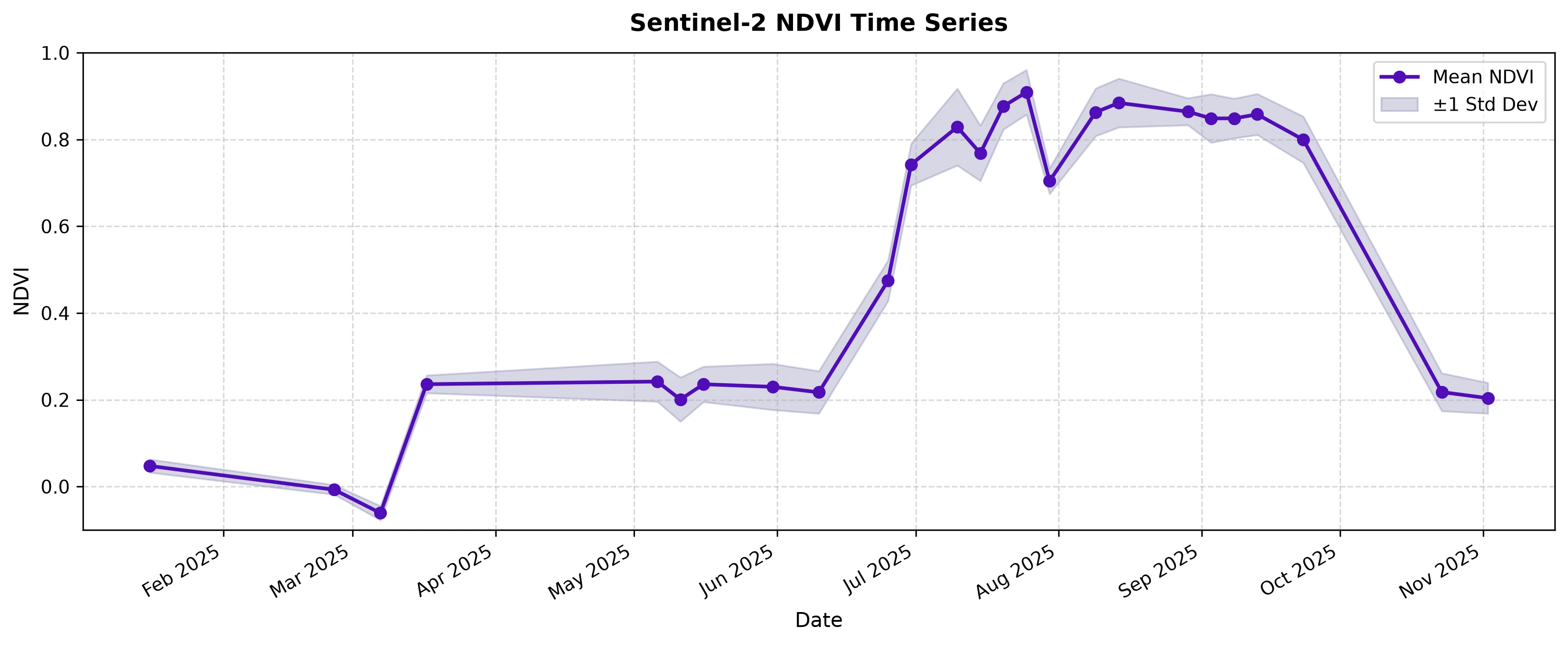
The time series shows how the NDVI value of the same AOI fluctuates over the year. For context, the AOI used in this example is an agricultural field in Ontario, Canada. NDVI stayed near zero from January to early March, when the field was bare or snow-covered. It then settled at around 0.2 from mid-March to early June, which is typical of bare soil with little to no crop cover. NDVI rose sharply in late June as the crop emerged and stayed above 0.7 from late June through September, peaking at 0.91 in late July. After harvest, NDVI dropped back to around 0.2 by late October. The gaps in the line are intervals where clouds or snow masked the whole field, so no statistics were returned.
Create a Mean NDVI Histogram
# Plot average Mean NDVI per calendar month

if len(df_clean) > 0:
    # 1. Create a month_name column from date_from
    df_clean["month_name"] = df_clean["date_from"].dt.strftime("%b")

    # 2. Average the mean NDVI per calendar month (across all years in the time range)
    month_order = ["Jan", "Feb", "Mar", "Apr", "May", "Jun", "Jul", "Aug", "Sep", "Oct", "Nov", "Dec"]
    monthly_avg = df_clean.groupby("month_name")["mean"].mean().reindex(month_order).dropna()

    # 3. Generate a categorical color palette with a unique color per month
    colors = sns.color_palette("tab20", n_colors=len(monthly_avg))

    # 4. Plot one bar per month
    plt.figure(figsize=(10, 5))
    plt.bar(
        monthly_avg.index,
        monthly_avg.values,
        color=colors,
        edgecolor="white",
        linewidth=0.8,
    )

    # Styling & Axes
    plt.title("Average Monthly Mean NDVI", fontsize=13, pad=12, fontweight="bold")
    plt.xlabel("Month", fontsize=11)
    plt.ylabel("Average Mean NDVI", fontsize=11)
    plt.ylim(-0.1, 1.0)
    plt.grid(True, axis="y", linestyle="--", alpha=0.3)

    plt.tight_layout()

    filename_hist = "ndvi_histogram_monthly_avg.webp"
    plt.savefig(filename_hist, dpi=300, bbox_inches="tight")
    print(f"Saved histogram image as: {filename_hist}")

    plt.show()
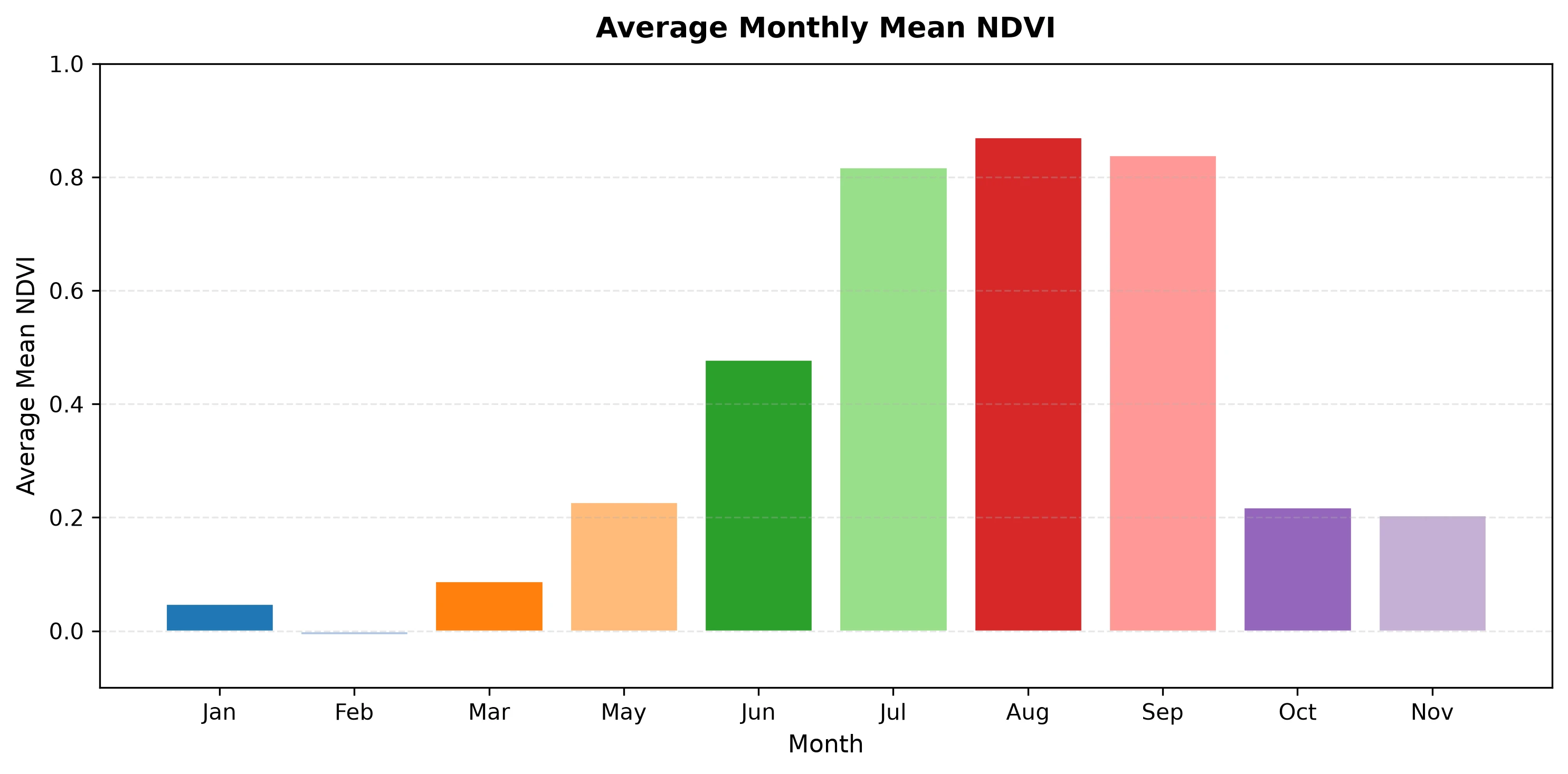
The histogram shows the average mean NDVI for each calendar month, with cloud-affected intervals already excluded. Each bar is colored individually so the months are easy to distinguish. The chart confirms the pattern seen in the time series: NDVI is near zero from January to March, rises through May and June as the crop is planted and emerges, peaks in August, and falls off after harvest. April and December are missing because no cloud-free interval was available for those months.
Create a Mean NDVI Box Plot
# 1. Load data
with open("statsreq.json", "r") as f:
    raw_data = json.load(f)

# 2. Normalize and rename columns
df = pd.json_normalize(raw_data["data"])
column_mapping = {
    "interval.from": "date_from",
    "outputs.ndvi.bands.B0.stats.mean": "mean",
    "outputs.ndvi.bands.B0.stats.stDev": "stDev",
    "outputs.ndvi.bands.B0.stats.min": "min",
    "outputs.ndvi.bands.B0.stats.max": "max",
    "outputs.ndvi.bands.B0.stats.percentiles.50.0": "median",
}
df = df.rename(columns=column_mapping)

# 3. Clean data
df["date_from"] = pd.to_datetime(df["date_from"])
for col in ["mean", "stDev", "min", "max", "median"]:
    if col in df.columns:
        df[col] = pd.to_numeric(df[col], errors="coerce")

df_clean = df.dropna(subset=["mean"]).copy()

# 4. Horizontal Box Plot (Blue fill, Red median line, No points)
if len(df_clean) > 0:
    plt.figure(figsize=(8, 3.5))

    sns.boxplot(
        x=df_clean["mean"],
        color="#1f77b4",  # Blue box
        width=0.4,
        medianprops={"color": "#e31a1c", "linewidth": 2.5},  # Red median line
        boxprops={"alpha": 0.8},
        flierprops={"markerfacecolor": "#e31a1c", "markeredgecolor": "none"},  # Outliers in red if any exist
    )

    # Styling & Formatting
    plt.title("Distribution of Mean NDVI Values", fontsize=13, pad=12, fontweight="bold")
    plt.xlabel("Mean NDVI", fontsize=11)
    plt.xlim(-0.1, 1.0)
    plt.grid(True, axis="x", linestyle="--", alpha=0.5)

    plt.tight_layout()

    filename_box = "ndvi_boxplot_horizontal.png"
    plt.savefig(filename_box, dpi=300, bbox_inches="tight")
    print(f"Saved horizontal box plot as: {filename_box}")

    plt.show()
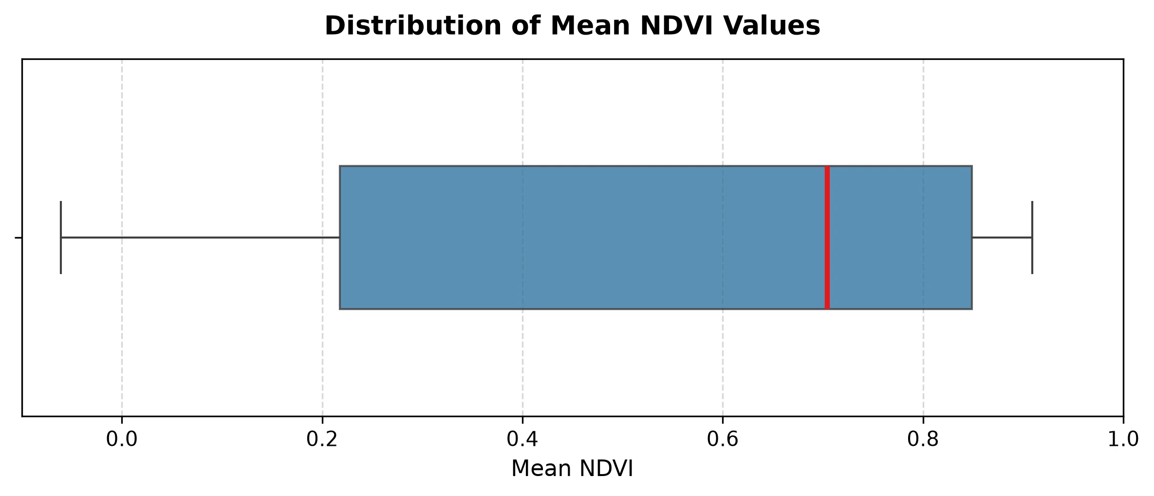
The box plot is a useful way of visualizing the median NDVI values as well as the percentiles. It allows us to view the trend in NDVI values in a bit more detail. The box spans from the 25th percentile (0.218) to the 75th percentile (0.849), which reflects the wide spread between the off-season values and the peak growing-season values seen in the time series. The median (0.704) sits closer to the upper end, since most of the cloud-free intervals that remain after filtering fall within the growing season.