Copy for LLM[View as Markdown](https://docs.planet.com/data/area-monitoring/visualizations/markers-summary/)
# Markers Summary
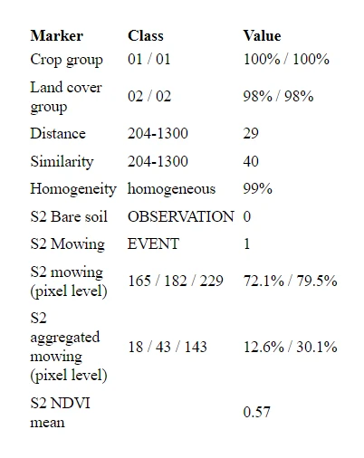
The Markers Summary *React* component is used to display a summary of markers (for example, crop group, land cover group, distance, similarity, homogeneity, bare soil, mowing, pixel mowing, mean NDVI) for selected Feature of Interest (FOI) and marker context, that can be filtered by Sentinel Hub (SH) collection type.
## Markers summary API
### Usage
```
```
### Component name
The component name `MarkersSummary` should be used when providing the *props*.
### Import
```
import { MarkersSummary } from '@area-monitoring/react-components';
import '@area-monitoring/react-components/style/all.css';
```
### Props
The *props* of the Markers Summary *React* component are described in the table below.
| Prop | Type | Default | Description |
| -------------------------------------------------------- | ------------------------------------- | ------- | --------------------------------------------------------------------------------------------------------------------------------------------------------------------------------------------------------------------------------- |
| `amServicesAuthToken`\* | `string` or callback `(() => string)` | | The AM services authentication token. Either as a string or a function that returns a string. |
| `markerServiceUrl`\* | `string` | | The (base) URL at which the endpoints for markers are. |
| `scope`\* | `string` | | The reference data differentiator. For more details see the [scope](https://docs.planet.com/data/area-monitoring/common.md#scope). |
| `foiId`\* | `string` | | The fully qualified ID of a FOI. |
| `markerContextId`\* | `string` | | The fully qualified ID of a marker context. |
| `shCollectionTypeId` | `string` | | The fully qualified ID of a SH collection type. If provided used to filter shown marker summaries by SH collection type. |
| `width` | `number` | `100%` | The width of the component in pixels.
Takes as input the number `100` or `"100"` number as a string. If the input is empty or wrong the component will default to `100%` css style and infer its size in pixels on its own. |
| `height` | `number` | `100%` | The height of the component in pixels.
Takes as input the number `100` or `"100"` number as a string. If the input is empty or wrong the component will default to `100%` css style and infer its size in pixels on its own. |
| `language` | `string` | `en` | The selected language at the time of rendering.
Options are: `sl` - Slovenian, `en` - English, `de` - German. |
| `markerTypeGroups`\* (if `markerTypeIds` is not defined) | `array` | | The array of marker type groups. The shown markers. |
| `markerTypeIds`\* (if `markerTypeGroups` is not defined) | `array` | | The array of marker type IDs. The shown markers. |
*\* indicates mandatory props*